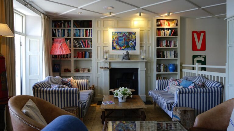
The quiet charm of what time leaves behind
There is something deeply calming about things that have aged softly — a wooden chair whose varnish has worn off, a cotton curtain that has faded into a lighter hue, or an old photograph that’s lost its sharp contrast. Faded colours remind us that beauty isn’t always found in what is new or perfect; it often lives in what time has touched gently.
In a world that constantly asks for the newest shade, the boldest tone, or the latest trend, there’s quiet rebellion in loving colours that have softened. The faded palette — of chalky blues, gentle greys, dusty pinks, and warm browns — tells stories of patience, sunlight, and time.
Why we are drawn to faded tones
There’s a reason old homes feel comforting, why a washed-out wall feels lived in, and why an old linen feels more luxurious than a brand-new synthetic fabric. Faded colours whisper familiarity. They don’t shout for attention; they invite you closer.
Psychologically, muted tones have a calming effect. They reduce visual noise and help our eyes rest. When colours age, they lose their harshness — much like people do. They become balanced, grounded, and emotionally richer.
Faded colours hold warmth. They remind us of early morning light, of seasons that passed, of the slow rhythm of things that were made by hand and used with care.
The art of choosing faded colours for home décor
Bringing this softness into your home doesn’t mean making everything old — it means creating a feeling.
Here’s how to begin:
1. Start with nature’s palette
Look around you: dry leaves, sunlit stone, terracotta pots, unpolished wood, river sand. These are nature’s faded tones. They’re never dull; they’re honest. Choose earthy hues that mimic natural wear — pale ochre, dusty green, or a gentle tan.
2. Layer, don’t match
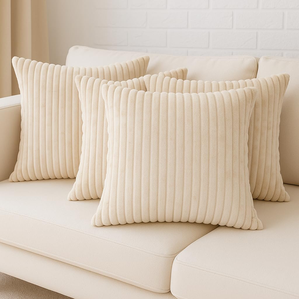
Perfection feels cold. Instead of buying a “set,” layer things over time — a beige cushion with a handwoven rug, a weathered trunk with a soft cream throw. Faded colours work beautifully when they’re allowed to overlap in unpredictable ways.
3. Play with light
Natural light brings faded colours to life. The same beige wall will look golden at noon and blush-toned at sunset. Avoid harsh artificial lights — use warm bulbs or lamps with cloth shades. Let shadows soften the space.
4. Texture is colour’s best friend
When tones are subtle, texture becomes the hero. Think of matte finishes, handwoven fabrics, unpolished wood, or uneven pottery. These add depth to the faded palette and make the space feel tactile and human.
5. Use white as a companion, not contrast
Bright white often feels too stark beside aged tones. Try creamy whites or off-whites — they blend softly without overpowering the quietness of faded colours.
How faded colours tell stories
Every worn surface carries a narrative. The chipped paint on an old cabinet speaks of hands that opened it a hundred times. A faded curtain remembers the afternoon sun that touched it daily.
Faded colours remind us that beauty is not fragile — it survives time. The walls of old homes in small towns, where the paint has turned pale from heat and rain, often look more poetic than any modern finish.
When you decorate with faded tones, you’re not just designing — you’re preserving stories. You’re saying that you value memory over novelty.
A corner from my own home
In my living space, there’s a small wooden table that once belonged to someone. I bought it from the ‘kabadi walah’. Its polish has dulled, and one leg creaked slightly. I restored it. On it sits a terracotta planter with a trailing money plant. The table’s faded brown has blended with the pale green of the leaves — both softened by sunlight that filters through a sheer cotton curtain.
Every morning, that corner reminds me that beauty is not in perfection, but in presence. It’s a lived-in kind of beauty — the kind that grows on you like patina on brass.
That’s the essence of faded colours: they age gracefully, not just visually but emotionally.
Creating a faded palette — room by room
🛋️ Living Room
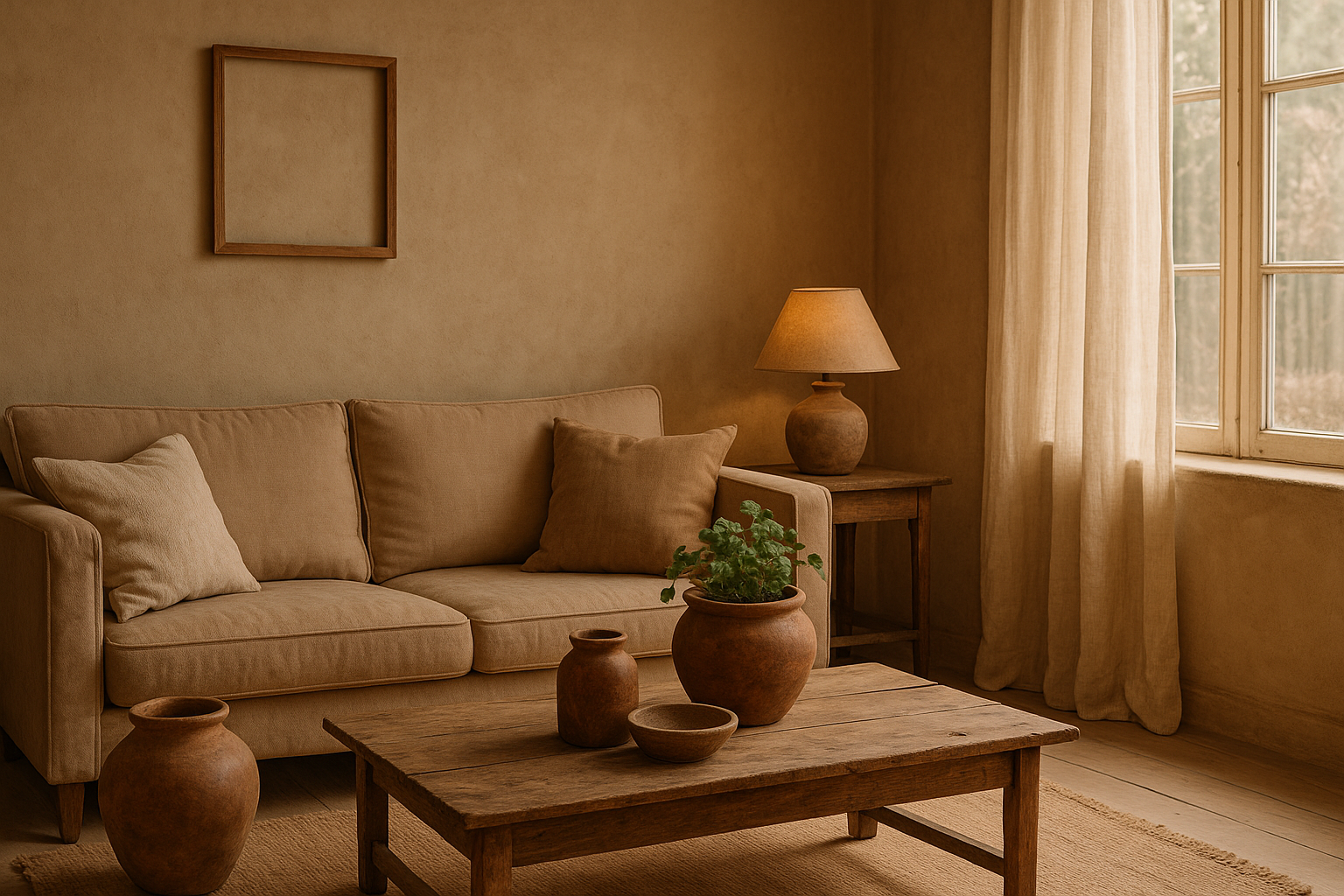
Let the living room breathe warmth. Use muted beige, sage green, and washed terracotta. Replace polished metal with brushed brass or copper. Add one faded rug — not perfectly new, but soft enough to tell a story.
🪞 Bedroom
Bedrooms thrive on calm. Choose dusty rose, misty blue, or warm linen tones. Faded cotton bedsheets, a handmade quilt, and light curtains that let morning sunlight in — they create serenity.
🍽️ Dining Area
This space loves natural tones. Pair a wooden table (even slightly uneven) with ceramic bowls in muted glazes. Faded napkins and stoneware plates complete the look — casual, imperfect, real.
🌿 Balcony or Garden
Nature already knows how to fade gracefully. Let clay pots age, don’t repaint them. Let moss grow. A chipped terracotta looks more soulful than a glossy one. Match your plant greens with old wood, woven baskets, and off-white cushions.
The emotional power of soft tones
Faded colours carry emotion differently than bright ones. A pale mustard feels nostalgic; a faded blue feels like memory. These colours don’t compete with what’s in the room — they let your mind rest.
In a way, decorating with faded tones is a form of slow living. You stop chasing the new and start noticing the subtle. The play of light, the texture of fabric, the way the air feels quieter around soft colours — it’s all part of the experience.
This approach isn’t about design alone; it’s about emotional rhythm. Homes with faded tones tend to feel more personal because they echo real life — gently worn, layered, and familiar.
Blending old and new
You don’t have to live in an old house to embrace this aesthetic. Modern spaces can carry the same soul when you combine new pieces with vintage finishes.
A freshly painted wall in muted clay, a new sofa draped with an old throw, a sleek lamp beside a handwoven basket — that’s the balance.
The secret is restraint. Don’t fill the room with faded tones alone; let them anchor the space. Use new things sparingly, so they enhance the softness rather than compete with it.
The role of craftsmanship
Handmade things naturally embody this faded charm. Whether it’s pottery, textile art, or hand-painted décor, they carry slight irregularities — lines that aren’t perfectly straight, brushstrokes that reveal texture, surfaces that breathe.
That’s what makes them beautiful. Machine-made items aim for perfection; handmade pieces embrace character.
Supporting handcrafted décor isn’t just about aesthetics — it’s about slowing down the rhythm of how we live and buy. It’s about choosing stories over products.
How to bring faded tones to life without making the space look dull
People often fear that muted colours will make their home look lifeless. The truth is, faded tones thrive on contrast and texture.
Try this simple layering:
- Start with an earthy wall — clay, sand, or olive.
- Add textiles — linen, khadi, or cotton in soft tones.
- Introduce warm metals like copper or brass.
- Place green plants or dried flowers for life.
Faded colours aren’t pale; they’re poetic. They need companions — wood, light, and movement. When arranged thoughtfully, they make even a small room glow softly.
Light, shadow, and the passing of time
The beauty of faded tones comes alive with changing light. Morning brings clarity, afternoon adds warmth, evening brings depth. Every moment reveals a different shade of calm.
Decor that changes with light connects your space to time — to the rhythm of the day. And that’s something no glossy finish can replicate.
This is what gives a home its living quality — it changes gently, like seasons do.
When colours hold memories
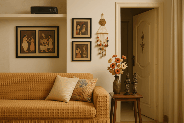
We rarely remember exact shades, but we remember how they made us feel. The mustard of your grandmother’s kitchen wall. The soft blue of an old bedsheet. The faded maroon of a clay pot.
Faded colours are tied to memory. They make a space feel human — not curated, not styled, but lived.
The deeper meaning behind faded beauty
Choosing faded colours is an act of acceptance. It’s choosing peace over perfection, time over trend.
When we live surrounded by things that have aged well, we subconsciously absorb their calm. We learn that softness can be strength. That time adds depth, not decay.
A faded home isn’t one that has lost its shine — it’s one that has found its soul.
The essence of Deepak Offline
At the heart of every handmade piece, restored chair, or vintage find lies this belief — that nothing truly loses beauty with time. It only changes form.
The philosophy of Deepak Offline has always been this: to slow down, to restore, to find meaning in imperfection. Faded colours are not a trend; they are a mood, a way of living with gentleness and gratitude.
When a home carries that feeling, every corner becomes a quiet poem.
